In this tutorial I will be teaching you how to edit CSS in your BuddyBoss child theme. We’ll start with a brief intro to child themes, and then I’ll use an example CSS edit to teach you how I would go about implementing it. This tutorial assumes you already have a working knowledge of how to write CSS.
Intro to Child Themes
A child theme is the safest and easiest way to modify the BuddyBoss theme, whether you want to make a few tiny changes or extensive changes. In WordPress a “child theme” is a theme that inherits the functionality of another theme, called the “parent theme”. It allows you to modify, or add to, the functionality of that parent theme. In our case BuddyBoss is the parent theme, and it comes pre-packaged with a starter child theme. We strongly recommend you activate your child theme as the primary theme, and make your CSS edits in the child theme files. The rest of this tutorial assumes you are using a child theme for your CSS edits.
Why use the packaged child theme?
We often release theme updates with bug fixes or new features, and if you’ve only modified your child theme you can safely upgrade BuddyBoss without losing any of your edits. The child theme inherits all of the templates and functionality from the parent theme, but allows you to change the appearance of the parent theme without editing any of its code, because code in the child theme overwrites code in the parent theme. More information can be found in our detailed Introduction to Child Themes.
Tutorial CSS Edit
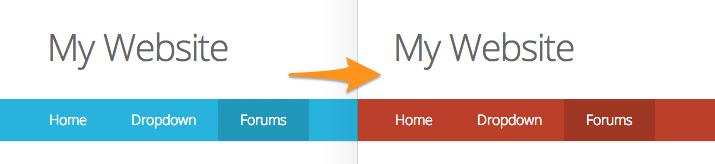
For the remainder of this tutorial, I will be implementing a dummy CSS edit so you can follow the exact steps I would take, and then apply those same steps to almost any other CSS edit you may want to implement. For this tutorial we will be changing the background color of the desktop primary navigation from the default Blue to Red. You can actually change this color without touching any code with the Customizer, but we’ll do it manually for the purposes of the tutorial.
This is a good example to use, because it’s easy to test, only applies to large screen sizes (requires media queries) and also overrides a Customizer setting. This single example covers most use case scenarios.
Here is the final change we are aiming for:
1. Hunt down the styles to edit
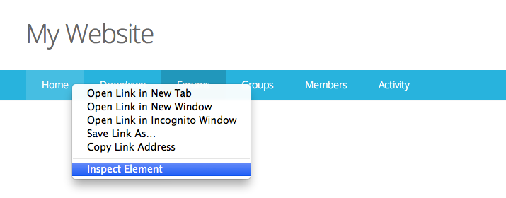
The first step in modifying a style found in the parent theme is to figure how and where that style is being generated. To do this, we will use the Web Inspector that comes with the Google Chrome web browser. It is an extremely valuable tool for any web developer, and makes it particularly easy to figure out where CSS styles are being defined in just about any website you visit.
While viewing your website in Google Chrome, right-click on the element you want to edit (the navigation) and click “Inspect Element”.
You will now be presented with a panel in your browser showing you all of the styles for the element you selected. If you accidentally clicked the wrong element, you can navigate through the HTML of the page until you grab the correct element, and you will see the Inspector highlighting elements on the page to let you know what you are about to select.
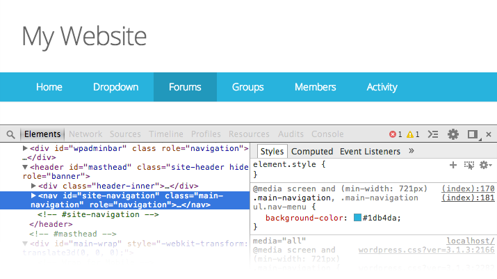
In the left column you can see the HTML, and in the right column you can see the corresponding CSS for the HTML element you have selected. You can actually click into the right column of the Inspector to play with the CSS and see a live preview of your changes immediately in the browser. This is usually how I experiment with potential CSS changes. For this tutorial, we will be adjusting the CSS selectors defined as .main-navigation, .main-navigation ul.nav-menu to have the attribute of background-color: #be3b2f, which defines the background color as Red using the appropriate HEX color value. Just click into the right column and change the background-color to #be3b2f and you should see the change in your browser. No need to save or refresh.
Keep in mind these edits are only happening in your browser. If you refresh the page, they will be lost. The next step is to make them permanent by adding them into your child theme’s stylesheet.
2. Add your CSS edits into your child theme
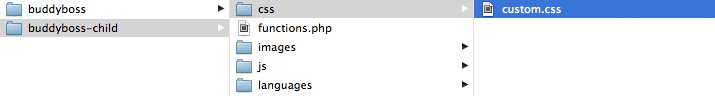
We recommend adding all of your CSS edits into your child theme at /themes/buddyboss-child/css/custom.css. Any styles added to this stylesheet will overwrite styles set in the parent theme’s /css/ folder.
Open your stylesheet in a text editor
 Open up
 custom.css in your favorite text editor. My personal favorite is Sublime Text 2. It’s free to try, powerful, lightweight and available on both Mac and Windows. Some popular alternatives are Coda for Mac (expensive but reliable) and the good old Notepad application that comes with Windows. If you prefer to edit the CSS directly in WordPress (not an ideal method) I suggest installing the WP Editor plugin. Among other things, it will allow you to navigate through the folder structure of the theme and will give you syntax highlighting.
Add your edits into the correct “media query”
Onward! The next step is to add your CSS edits into custom.css. When you first open up the file, you will notice that it is broken down into sections based on media queries, allowing the theme to be “responsive” for mobile devices. Media queries allow CSS to load based on different screen sizes. We start with global styles that are loaded for all screen sizes. Then we narrow down to sizes below or above certain widths (to approximate which device you are using), targeting each width using specific CSS. In BuddyBoss we generally break it down into phone, tablet, and laptop & desktop as the three primary screen sizes.
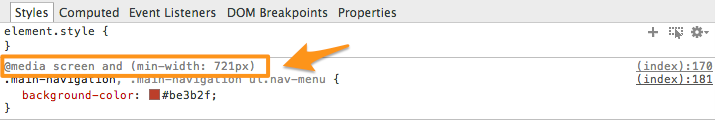
Go back to your Inspector for a second. You’ll notice that the color we’ve applied to the navigation is in fact located within a media query! This particular media query specifies that the style is to be applied only when screens are 721px or wider. You will want to add your CSS edit into this same media query in custom.css.
In the Chrome Inspector, you can actually just put your cursor into the inspector and copy the whole code snippet. Then back at custom.css, paste the CSS you copied from the Inspector into the corresponding media query. It should look something like this:
/*--------------------------------------------------------------
2.3 - MINIMUM width of 721 pixels (tablets+)
--------------------------------------------------------------*/
@media screen and (min-width: 721px) {
.main-navigation, .main-navigation ul.nav-menu {
background-color: #be3b2f;
}
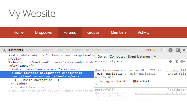
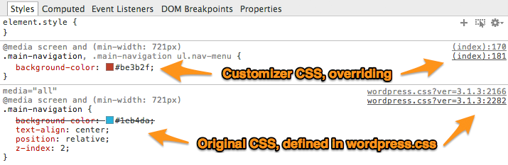
}/* don't delete this closing bracket */Ordinarily this would be the final step. However you will likely see no change in your browser. The reason is that this particular style happens to be defined additionally in the Customizer, which injects styles right into the HTML, thereby overriding stylesheets with all of the custom color selections from the admin options. The inline Customizer styles are taking over. You can tell this by going back to the Chrome Inspector. You will see that this particular style is not coming from a stylesheet, but rather from (index) which just means it’s coming from the HTML file.
Override the Customizer
For this particular CSS edit, we will need to override the Customizer’s priority. This is actually very simple. We just need to add an !important declaration to our style attribute. Like so:
/*--------------------------------------------------------------
2.3 - MINIMUM width of 721 pixels (tablets+)
--------------------------------------------------------------*/
@media screen and (min-width: 721px) {

   .main-navigation, .main-navigation ul.nav-menu {
      background-color: #be3b2f !important;
   }
}/* don't delete this closing bracket */
If you did everything correctly, you should now see Red navigation on your site. You can follow these steps for pretty much any CSS edit. And always make sure to add the CSS into the proper media query, or to no media query (the beginning Global section) depending on what screen size you need to target.
Extra Tip: Mobile CSS
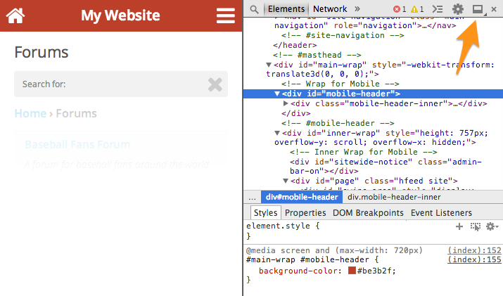
Editing mobile CSS is no different from desktop CSS. While using the Chrome Inspector, make your browser window tiny enough that the layout collapses to mobile mode. It helps to dock the Inspector to the right side of the screen in this case, by clicking on the little square icon, to free up room to see everything. Then just follow the same steps and add your edits into the appropriate “small screen” media queries.
If you want to see something really cool, check this out. You can plug your Android device into your computer and inspect/edit CSS loading from your Android device within the Chrome browser on your desktop. This is how I test things natively on Android and it saves a ton of time. Make sure to download Chrome beta on your Android device for this to work (as of February 13, 2014).