Community UX design determines whether your platform feels like a welcoming neighborhood or a confusing maze.
Thoughtful design choices around navigation, layout, and accessibility directly influence whether members participate once or become active contributors.
This guide explains exactly how design shapes engagement and what you can do about it.
What is Community UX Design
Community UX design is the practice of creating online spaces where member interactions feel natural, enjoyable, and friction-free.
It encompasses every touchpoint: how someone discovers groups, posts their first comment, receives notifications, and navigates between conversations.
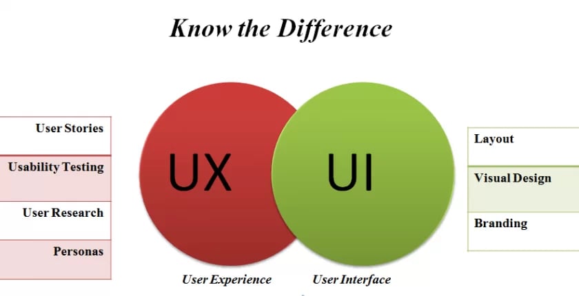
UX (user experience) differs from UI (user interface) in an important way. UI is what members see—buttons, colors, typography, layouts. UX is what members feel—the ease of completing actions, the satisfaction of finding what they need, the emotional response to the entire experience.
A beautiful interface with terrible UX is like a stunning restaurant with no menus, confusing seating, and waiters who disappear. The aesthetics don’t matter if the fundamental experience frustrates people.
In community contexts, UX design focuses specifically on social interactions. Can members find relevant discussions quickly? Does posting feel effortless? Do notifications bring them back without overwhelming them?
These micro-experiences accumulate into overall satisfaction or frustration.
Why UX Design Matters for Community Engagement
Design shapes behavior. When actions require minimal effort, people do them more frequently. When interfaces create friction, participation drops.
Higher participation rates stem from reduced barriers. If posting a comment takes three clicks instead of seven, members comment more often. If finding a group requires clear navigation instead of hidden menus, more people join groups. Each unnecessary step filters out a percentage of potential participants.
Better content discovery keeps members engaged longer. Well-designed communities surface relevant discussions, highlight trending topics, and recommend groups based on interests. Members who find valuable content quickly stick around. Those who can’t find anything interesting leave permanently.
Improved member satisfaction builds loyalty. Frustrating experiences erode goodwill even when content is excellent. Smooth experiences create positive associations that keep members returning even during slower content periods.
Increased retention directly impacts community growth. Acquiring new members costs time and money. Retaining existing members is exponentially more efficient. Strong community UX design reduces churn by making the platform pleasant to use.
Research on online communities consistently shows that usability issues are among the top reasons people abandon platforms. Content quality matters, but if members can’t easily access that content, quality becomes irrelevant.
Key UX Design Elements That Drive Engagement
Here’s a few top elements you should care about-
Simple and Intuitive Navigation
Members should find what they’re looking for in two clicks maximum. Groups, recent posts, notifications, and profile settings need prominent placement with clear labels.
Clutter-free layouts increase time spent in communities because members focus on content rather than deciphering where to click next. Every unnecessary menu item, every ambiguous icon, every hidden feature creates cognitive load that reduces engagement.
Consider two community platforms. Platform A has a sidebar with 20 options, nested menus three levels deep, and features scattered across multiple tabs.
Platform B has five main sections, each clearly labeled, with secondary options appearing contextually when needed. Platform B will see higher engagement because navigation doesn’t require mental effort.
Community UX design prioritizes the 80/20 rule: make the 20% of features that members use 80% of the time incredibly easy to find.
Consistent Branding and Visual Hierarchy
Consistent colors, icons, and typography build familiarity. When buttons look the same across pages, members learn patterns quickly. When every section uses different styling, members must relearn navigation constantly.
Visual hierarchy guides attention naturally. Primary actions (posting, commenting, joining) should stand out through size, color, or placement. Secondary actions (editing settings, reporting content) can be less prominent without being invisible.
The link between visual appeal and long-term engagement is well-documented. Attractive interfaces create positive first impressions that increase the likelihood someone will push through initial unfamiliarity. Ugly interfaces trigger immediate skepticism about the entire platform’s quality.
Consistency also builds trust. Professional, cohesive design signals that the community is well-maintained and trustworthy. Inconsistent design suggests neglect or lack of attention to detail.
Responsive and Mobile-Friendly Experience
Most community members access platforms on mobile devices. If your community isn’t optimized for small screens, you’re excluding the majority of potential participants.
Mobile optimization means more than shrinking desktop layouts. Touch targets need adequate spacing. Text needs readable sizing without zooming. Navigation requires thumb-friendly placement. Forms should minimize typing through smart defaults and selection menus.
Responsive community UX design adapts interfaces to screen size automatically. Members get an experience tailored to their device without downloading separate apps or dealing with broken layouts.
Communities that neglect mobile experience see dramatically lower engagement from mobile visitors. Those visitors don’t convert into active members, they leave immediately because the experience feels broken.
Build Your Mobile First Community – https://www.buddyboss.com/blog/mobile-first-community-building/
Personalized Dashboards and Feeds
Personalization is a core principle for driving meaningful engagement.
Generic experiences result in generic interaction, while personalized dashboards and activity feeds keep members connected to content and discussions relevant to their interests.
By prioritizing content based on group memberships and past behavior, these feeds prevent valuable posts from getting lost in noise.
Custom member profiles allow individuals to showcase their identity, interests, and achievements within the community, fostering a sense of ownership that encourages participation.
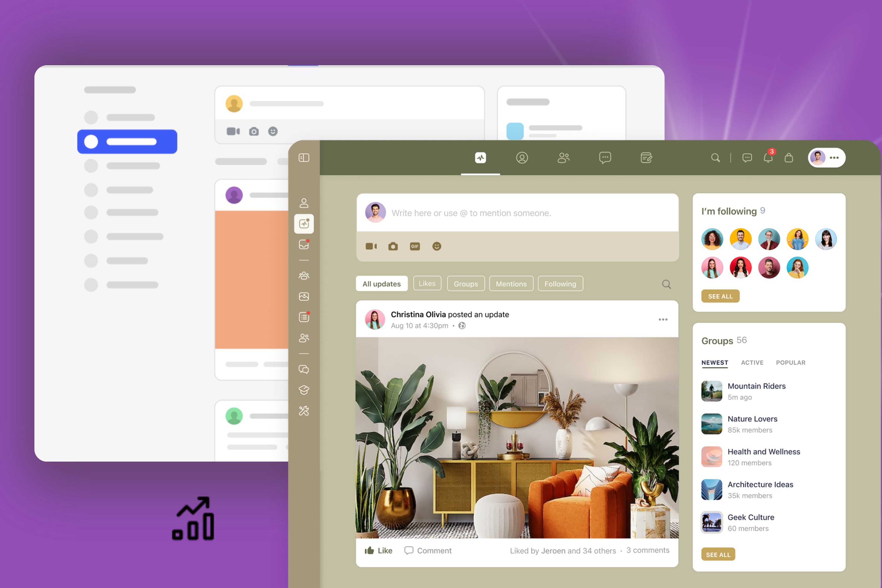
Leading platforms like BuddyBoss implement these principles by showing members content from their groups and connections first, supporting custom profile fields, badges, and achievements that make each profile unique.
Importantly, effective personalization doesn’t require complex AI; even simple filtering by group membership outperforms generic content dumps, enhancing engagement and satisfaction.
Accessibility and Inclusivity
Accessible design ensures everyone can engage regardless of device, ability, or technical knowledge. This isn’t optional altruism—it’s practical business sense that expands your potential member base.
Key accessibility features in community UX design include sufficient color contrast for readability, keyboard navigation for those who can’t use mice, alt text for images, and proper heading structure for screen readers.
Inclusivity extends beyond technical accessibility. Use clear language without jargon. Provide help documentation at the point of need. Design for varying levels of technical comfort.
Communities that prioritize accessibility see broader participation across age groups, technical abilities, and backgrounds. Those that ignore accessibility exclude significant portions of potential members without realizing it.
How BuddyBoss Aligns With Good UX Principles
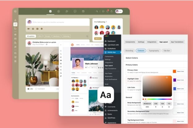
BuddyBoss helps businesses and creators build communities with user experience at the foundation. The platform combines WordPress flexibility with purpose-built community features designed around how people actually interact online.
Clean interface with customizable layouts means you’re not locked into a single design approach. Adjust spacing, colors, and component placement to match your brand while maintaining usability best practices.
Member profiles and activity feeds create personalized experiences out of the box. When configured, members see activity from their groups and connections prioritized in feeds.
BuddyBoss App provides a branded, native mobile experience designed for community engagement. No responsive web compromises, actual apps built for touch interfaces and mobile behaviors.
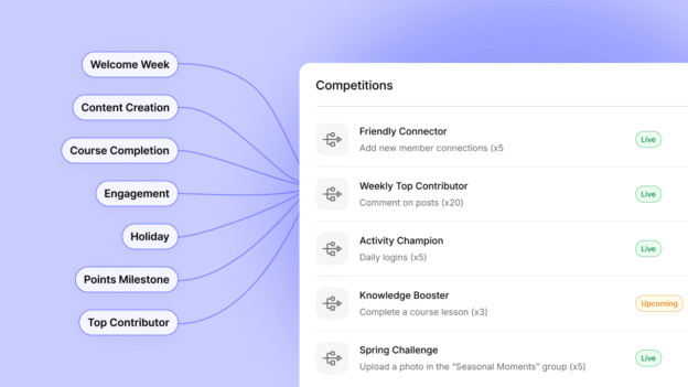
BuddyBoss supports engagement systems such as badges and points via GamiPress integration. Good community UX design makes recognition visible and satisfying.
BuddyBoss simplifies community setup by managing backend complexity through WordPress. This separation of complexity is what allows non-technical community builders to create professional experiences.
Common UX Mistakes That Hurt Engagement
Overloading users with too many features creates decision paralysis. When members face 15 different actions they could take, they often take none. Simplify options to the most valuable actions.
Confusing navigation or cluttered interfaces force members to work harder than necessary. If people need tutorials to find basic functions, your navigation has failed. Intuitive design shouldn’t require explanation.
Ignoring feedback and analytics means you’re designing based on assumptions rather than reality. Members tell you what’s not working through their behavior and their complaints. Failing to listen guarantees poor experiences persist.
Lack of consistency across web and mobile experiences creates fragmented understanding. Members learn your platform once—if web and mobile work differently, you’re forcing them to learn twice. That friction reduces usage of whichever platform feels less familiar.
Many community builders add features because competitors have them without considering whether those features serve their specific members. Feature bloat is the enemy of good UX.
Design for People, Not Platforms
Great community UX design makes members feel understood, supported, and connected. It reduces friction between intent and action. When someone wants to share an idea, good design makes posting effortless. When someone needs help, good design surfaces relevant resources immediately.
Want to create a community that looks great and feels effortless to use?
Explore how BuddyBoss helps you design experiences that keep members coming back through intuitive navigation, personalized feeds, and seamless mobile experiences.
Strong community UX design is what transforms casual visitors into engaged members who build your community’s culture.
Start with clarity, optimize for ease, and never stop refining the experience based on how members actually use your platform. That’s how design drives engagement.

